Mastering 5 Team Member UI Elements for Modern Web Design
In the fast-paced world of web development, first impressions are often dictated by the "About Us" or "Our Team" section. This is where human connection meets digital interface. Many designers and developers overlook the subtle impact of well-crafted Team Member UI Elements, treating them as an afterthought rather than a core component of user trust. However, utilizing a robust set of five distinct team member widgets can transform a static page into a dynamic showcase of your brand’s personality. When these elements are designed with scalability and ease of use in mind, they become powerful tools for communication.
The appeal of a pre-built Web-UI Kit lies in its efficiency. Instead of building from scratch, you gain access to components that are already balanced for visual hierarchy and responsiveness. Yet, simply downloading a template is not enough. To truly leverage these assets, one must understand how to customize them effectively without breaking the design integrity. This guide explores common pitfalls when implementing team member widgets and offers practical advice on maximizing their potential within Figma.
The Trap of Ignoring Visual Consistency
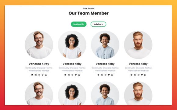
One of the most frequent mistakes beginners make when using team member widgets is neglecting visual consistency across different profiles. You might have five different layouts in your kit, but if you mix them randomly without a unifying theme, the result looks chaotic. Users subconsciously look for patterns. If one team member has a circular photo with a blue background and another has a square photo with no background, it creates cognitive dissonance. This inconsistency can undermine the perceived professionalism of your entire site.
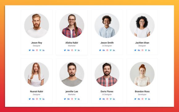
To avoid this, establish a strict style guide before you begin placing images. Decide on a uniform shape for avatars—whether circles, rounded squares, or full rectangles. Ensure that the typography used for names and job titles remains identical in weight and size across all five elements. A clean, modern design relies on repetition. By keeping the structural elements consistent, you allow the unique personalities of the team members to shine through their photos and bios, rather than distracting the viewer with erratic layout changes.
Misunderstanding Scalability and Responsiveness
Another critical area where users stumble is the assumption that a design looking good on a desktop will automatically translate to mobile devices. Many Team Member Widget Designs are created with fixed dimensions. When you resize these for smaller screens without adjusting the internal constraints, text overlaps, images stretch, and padding disappears. This leads to a poor user experience, particularly for the growing number of consumers browsing on smartphones.
The solution lies in understanding the auto-layout features in Figma. Since the source file format is Figma, you have access to powerful responsive tools. Before exporting or handing off to developers, test each of the five elements by resizing the frame. Ensure that the layers are fully organized and set to "fill" or "hug" contents appropriately. If an element is 100% scalable, it should adapt gracefully. Check that the Google Fonts used remain legible at smaller sizes. If the text becomes too small, adjust the font size specifically for the mobile breakpoint. This proactive approach saves hours of debugging later in the development phase.
Overlooking Color Customization Potential
A significant advantage of high-quality UI kits is the ability to easily change color styles. However, many users fail to utilize this feature effectively, sticking to the default colors provided in the template. While the defaults are often aesthetically pleasing, they may not align with your specific brand identity. Using mismatched colors can make the team section feel disconnected from the rest of your website, creating a fragmented brand experience.
Take the time to explore the color styles embedded in the Figma file. Most professional kits use global color styles. By updating the primary and secondary color variables, you can instantly refresh the look of all five team member elements to match your brand palette. For instance, if your brand uses a deep navy and a vibrant orange, apply these to the hover states, background accents, or button links within the widget. This ensures that the interactive elements feel native to your site. Remember, customization is not just about changing images; it is about adapting the entire emotional tone of the component to suit your audience.
Neglecting Image Quality and Aspect Ratios
It sounds obvious, but poor image quality is a silent killer of good design. Even the most beautifully crafted Team Member UI Element will look amateurish if populated with low-resolution or inconsistently cropped photos. A common mistake is uploading images with different aspect ratios into frames that expect a specific dimension. This results in distorted faces or awkward cropping that cuts off heads or shoulders.
To maintain a polished look, standardize your photography process. Ensure all team member photos are taken with similar lighting and backgrounds. In Figma, use the "Fill" or "Fit" options carefully. If the widget uses a circular mask, ensure the subject’s face is centered. If the design allows for creative freedom, consider using a consistent filter or color overlay on all images to unify them further. High-quality visuals communicate competence and attention to detail, reinforcing the credibility of the individuals presented.
Forgetting Accessibility and Readability
Finally, many designers focus so much on aesthetics that they forget accessibility. Text placed over busy images or using low-contrast color combinations can be difficult to read for users with visual impairments. This is not just a usability issue; it is an inclusivity issue. If a visitor cannot read a team member’s name or role, the widget fails its primary purpose.
Always check the contrast ratio between your text and background. If you are using a photo as a background, consider adding a semi-transparent overlay to ensure the white or dark text stands out. Use clear, sans-serif Google Fonts that are easy to scan. Keep the hierarchy clear: the name should be the most prominent element, followed by the role, and then the bio or social links. By prioritizing readability, you ensure that your team section is welcoming to all users, regardless of their abilities.
Making the Right Choice for Your Project
When evaluating a Web-UI Kit for your next project, look beyond the surface-level aesthetics. Check if the layers are fully organized and named logically. This organization is crucial for efficient editing. Verify that the file uses standard Google Fonts, which ensures compatibility and easy implementation in code. Ensure that the five team member elements offer variety without sacrificing cohesion. Look for features like hover states, social media icons, and clear call-to-action buttons.
By avoiding these common mistakes and focusing on consistency, scalability, branding, image quality, and accessibility, you can create a team section that not only looks professional but also enhances user trust. The right UI elements are not just decorative; they are functional tools that help tell your story. Take the time to customize them thoughtfully, and your website will reflect the care and professionalism of the team behind it.